

Appearance
Sintel Apps Designer – Overview (Tour)
Designer
The Sintel Apps designer is where you build a form for a SharePoint list: its layout, its rules, its workflow and its settings. This page is a short tour. Each tab has its own overview article.
Open the designer
- From a list: in the list's command bar, select Sintel Apps. The button shows on lists (not libraries). It's greyed out if you can't manage the list.
- From the Sintel Apps page of the site: choose a list in the top bar, or create one. See Configure Sintel Apps on a Site and How to Create a New List.
If the site has no Sintel Apps page yet, the Sintel Apps button tells you to create one first.
Who can design forms
To open a list's form in the designer you need Manage List permission on that list. To save the design you need Manage Lists permission on the site. Without Manage List permission on the list, the designer says You do not have permissions to view this form's configuration. Ask a site owner for access.
The top bar

From left to right:
| Part | What it does |
|---|---|
| Layout, Logic, Workflow, Settings | The four tabs (see The four tabs). The arrow after Settings jumps to a part of the settings |
| Search box | Finds fields, sections, rules, statuses, actions, emails and settings (below) |
| List name | The list you're designing. The arrow opens the list selector: other lists, New list..., Import configuration... and Include hidden lists. The link icon (Go to list) opens the list in SharePoint |
| Check mark | The validation indicator (below) |
| Download icon | Export Configuration: saves the form's design to a file, once the form is saved. See Importing and Exporting Form Configuration |
| Save | Saves the design. The arrow offers Save, Save & Exit and Exit. A dot on the button means there are unsaved changes |
Nothing changes in the form or the list until you save. Columns for new fields are created in the list when you save.
Search
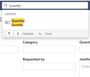
Type at least two letters in Search fields, sections, rules, statuses, settings.... The results are grouped by tab. Select one, or use the arrow keys and Enter, to jump there. The designer opens the tab, selects the item and shows its properties. Settings results take you to that part of the settings.
The validation indicator
- Green check: no problems.
- Yellow triangle: warnings, for example a workflow action without an audience.
- Red circle: errors. Save and Save & Exit are greyed out until you fix them.
Select the indicator to see the list. Select a line to jump to the problem.
The four tabs
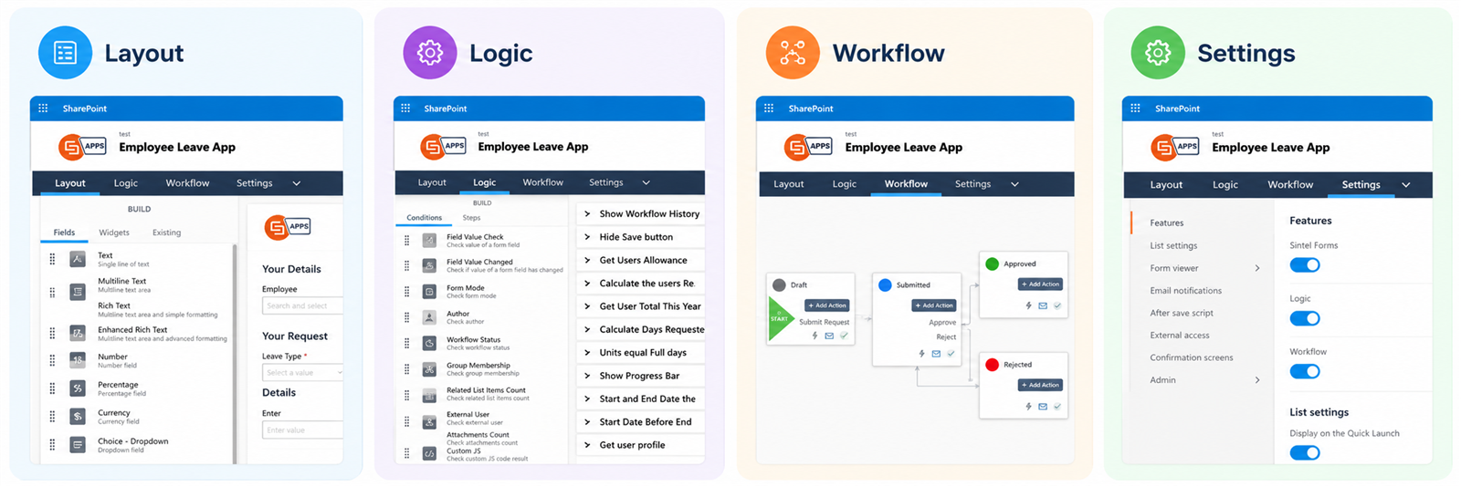
| Tab | What you do there | Overview |
|---|---|---|
| Layout | Add fields and widgets, arrange them in sections and tabs, set their properties and the look of the form | Layout Tab (Overview) |
| Logic | Rules that react to the form: show or hide, make required or read-only (Field state), set values, show your own error message (Field custom error) | Logic Tab (Overview) |
| Workflow | Statuses, and actions that move items between them, with who can do them | Workflow Tab (Overview) |
| Settings | Settings for the whole form: features, list settings, attachments, emails, PDF export, external access, licence | Settings Tab (Overview) |
Logic and Workflow work only when they're turned on in Settings → Features.
A typical way to build a form
- Lay out the fields on the Layout tab.
- Add rules on the Logic tab.
- Add a workflow, if the form needs approvals.
- Check the Settings, then save and try the form. See Using a Form for what people see.
Next: Layout Tab (Overview).