

Appearance
Choice Fields
Designer › Layout › Fields › Choice - Dropdown, Choice - Single, Choice - Multi
Choice fields let people pick from a list of options you set, for example a category or a priority. Answers stay consistent, so they are easy to filter, count and use in rules. There are three types:
| Name under Fields | Type in the properties | How it looks | People pick |
|---|---|---|---|
| Choice - Dropdown | Choice - Dropdown | A drop-down list | One option |
| Choice - Single | Choice - Radio (Single) | All options shown as round buttons | One option |
| Choice - Multi | Choice - Checkbox (Multiple) | All options shown as check boxes | Any number of options |
Use Choice - Dropdown for longer lists. Use Choice - Single when people should see all options at once. Use Choice - Multi when more than one answer can be true.
Add a choice field
- In the Layout tab, open Fields on the left.
- Drag Choice - Dropdown, Choice - Single or Choice - Multi into a section.
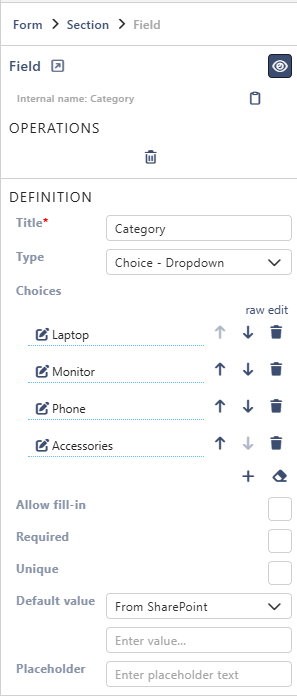
- Select the field. Under Choices in the properties panel, type the options.
The list column is created when you save the form.
Properties
Each property is described in Field Properties. Choice fields have these under Definition:
| Property | Dropdown | Single | Multi |
|---|---|---|---|
| Title | ✓ | ✓ | ✓ |
| Type | ✓ | ✓ | ✓ |
| Choices | ✓ | ✓ | ✓ |
| Allow fill-in | ✓ | ✓ | ✓ |
| Required | ✓ | ✓ | ✓ |
| Unique | ✓ | ✓ | |
| Number of columns | ✓ | ✓ | |
| Default value | ✓ | ✓ | ✓ |
| Placeholder | ✓ | ✓ | ✓ |
Below them are the parts every field has: Select field instance, Behavior, Label and Field theme.
Good to know
For choice fields:
- Default value: with Custom, type the name of an option. For Choice - Multi, type several names separated by commas, for example Laptop, Phone.
- Unique: Choice - Multi can't be unique.
- Placeholder: Choice - Single and Choice - Multi show it only in the fill-in box, so only with Allow fill-in.
On the form
One field of each type side by side, each named after its type. Choice - Single and Choice - Multi have Number of columns set to 2:

The options go down the first column, then the next.
With Allow fill-in, people can also type their own answer when no option fits:
- Choice - Dropdown: they type in the box.
- Choice - Single and Choice - Multi: the last option has a text box. In Choice - Multi, a new empty box appears when one is filled, so people can add several answers.
Good to know
- Keep option names short and clear. Rules compare the option name, ignoring capitals. After you rename an option, check the rules that use it, both conditions and Field value steps.
- An option typed in with Allow fill-in is saved as it is. It isn't added to the list of options.
Related: Field Properties, Layout Tab (Overview).