

Appearance
Field Properties
Designer › Layout › select a field › Properties
When you select a field on the form, its properties appear in the Properties panel on the right. This page describes every property, in the order of the panel. Each property says which field types have it.
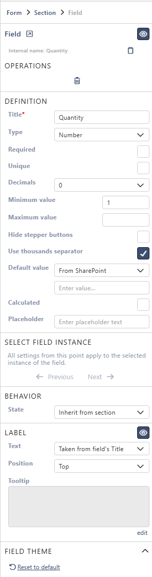
The panel has these parts:
- At the top: the field's internal name and a few buttons.
- Definition: the settings of the list column. They apply wherever the field is placed.
- Select field instance: which copy of the field you are changing, when it's on the form more than once.
- Behavior, Label and Field theme: how this copy of the field looks and behaves on the form.
Widgets have the same Select field instance, Label and Field theme, but no Behavior.
At the top
Internal name
Fields: All
The name of the column in SharePoint. You use it in formulas, tokens and scripts, for example {{Quantity}}. Until the field is first saved, it follows the Title, without spaces or special characters. For example, Enhanced rich text becomes Enhancedrichtext. After the first save it never changes, even if you rename the field. The icon next to it copies the name.
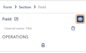
Toggle visibility
Fields: All
The eye icon next to Field hides the field on the form. It hides every copy of the field. A rule in the Logic tab can show it again with the step Field visibility.
Go to SharePoint field settings
Fields: All
The arrow icon next to Field opens the column's settings in SharePoint. For a related list or library, it opens that list or library. It works once the field is saved.
Go to target SharePoint list
Fields: Lookup
Opens the list the lookup takes its values from. It works once a Lookup list is chosen.
Delete
Fields: All
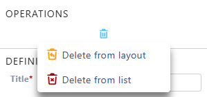
The bin icon offers two choices:
- Delete from layout removes this copy of the field from the form. The column and its data stay in the list. You find the field again on the Existing tab, under Unused.
- Delete from list also deletes the column, with all its data, when you save the form. Built-in columns such as Created can't be deleted.
For a field that isn't saved yet, the bin just deletes it.
Definition
The settings of the list column itself. If the field is on the form more than once, they apply to every copy.
Title
Fields: All
The name of the column. It's also the label on the form, unless you set a custom label.
Type
Fields: All except Signature
The field type. Some types can be switched to a related type:
- Multiline Text, Rich Text and Enhanced Rich Text.
- Number, Currency and Percentage.
- Choice - Dropdown, Choice - Radio (Single) and Choice - Checkbox (Multiple).
- Person, Group and Person or Group.
- Date Only and Date Time.
- Hyperlink and Picture.
For Text, Lookup, Yes/No, Related List and Related Document Library, the type is shown but can't be changed.
Important: some switches can lose data in existing items. Going from Enhanced Rich Text or Rich Text to a simpler type removes formatting. Going from Choice - Checkbox (Multiple) to a single choice keeps only the first value of each item. The designer asks you to confirm first.
Required
Fields: All except Related List and Related Library
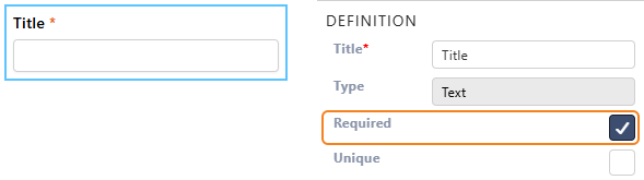
A value must be given before the item can be saved. This is set on the SharePoint column, so it also applies outside the form. The field is then always mandatory on the form, and its State can't be Optional.
Unique
Fields: Text, Number, Currency, Percentage, Choice - Dropdown, Choice - Single, Lookup, Person, Group, Person or group, Date, Date Time
No two items can have the same value in this column. Not available while Allow multiple values is on.
SharePoint checks it when the item is saved, not while people type. If another item already has the value, the item isn't saved, and an error names the field: The field '…' does not accept the provided value. The field might expect a unique value.
Append only
Fields: Multiline text, Rich text, Enhanced rich text
The SharePoint setting Append changes to existing text. New text is added to the column's history instead of replacing what was there.
On the form, people add new text in the box. Below it, the latest entry is shown with its author and date. Show more lists all earlier entries.
Show character count
Fields: Multiline text
Shows a character counter under the text box.
Max length
Fields: Text, Multiline text
The most characters people can type. For Text, it's 1 to 255.
Number of lines
Fields: Multiline text, Rich text, Enhanced rich text
The height of the text box, in lines (2 to 200).
Auto height
Fields: Multiline text, Rich text, Enhanced rich text
The text box grows as people type. On for new fields.
Decimals
Fields: Number, Currency, Percentage
How many decimal places are shown: Automatic, or 0 to 5.
Minimum value
Fields: Number, Currency, Percentage
The lowest value people can enter. Leave it empty for no limit. For Percentage, the label is Minimum value (%). You enter percent, for example 10 for 10%.
Maximum value
Fields: Number, Currency, Percentage
The highest value people can enter. It works like Minimum value.
Hide stepper buttons
Fields: Number, Currency, Percentage
Hides the up and down arrows in the number box.
Use thousands separator
Fields: Number, Currency, Percentage
Groups the digits, for example 1,250 instead of 1250.
Format
Fields: Currency
The currency and how its amounts look, for example $123,456.00 (Canada). It starts with your site's regional setting.
Choices
Fields: Choice - Dropdown, Choice - Single, Choice - Multi
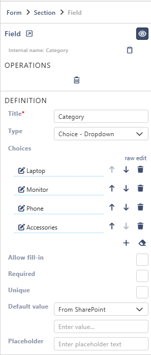
The options people choose from. Select an option's text to edit it. The arrows next to it move it up or down, and the bin deletes it. Below the list, the + icon adds an option and the eraser icon removes them all. To type or paste all options at once, select raw edit and put one option on each line. editor switches back.
Allow fill-in
Fields: Choice - Dropdown, Choice - Single, Choice - Multi
People can type their own value when none of the options fits.
Number of columns
Fields: Choice - Single, Choice - Multi
Shows the options in this many columns, side by side. Useful for long lists of short options.

Lookup list
Fields: Lookup
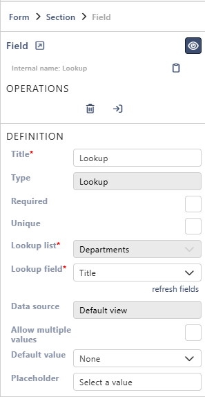
The list the lookup takes its values from. Choose New list... to create a new list when you save the form. Then give it a List title. You can choose the list only while the field is new.
Lookup field
Fields: Lookup
The column of the Lookup list that people see, for example Title.
Only the ID and the columns in the default view of that list are offered. If a column is missing, add it to the list's default view in SharePoint, then select refresh fields.
Data source
Fields: Lookup
Shows where the items come from: the Default view of the lookup list. It can't be changed.
Allow multiple values
Fields: Lookup, Person, Group, Person or group
People can pick more than one value. Turning it off on a saved Lookup field asks you to confirm, because extra values in existing items can be lost.
Choose from
Fields: Person. For Group and Person or group it's shown greyed out.
Limits the people picker to the members of one SharePoint group. It works only when Type is Person. People must be able to see the group's members. In SharePoint, set the group so that everyone can view its membership.
Display as
Fields: Yes/No
How the field looks: Text, Icon or Switch. With Switch, you can set a Yes label and a No label, the texts next to the switch.

Default value
Fields: Text, Multiline text, Rich text, Enhanced rich text, Number, Currency, Percentage, Choice, Lookup, Person, Person or group, Yes/No, Date, Date Time
The value a new item starts with. Each field type offers only the options that make sense for it:
| Option | The new item starts with | Field types |
|---|---|---|
| None | An empty field | All of the above |
| Custom | A value you type | All of the above |
| Query Parameter | A value from the address of the form. See Query Parameter | All of the above |
| Today | Today's date, or a number of days from today: 1 is tomorrow, -1 yesterday. For Date Time, the current date and time | Date, Date Time |
| Current User | The person filling in the form | Person, Person or group |
| From SharePoint | The default value of the list column. Changing it here changes it in SharePoint too | Text and the multiline types, the number types, Choice, Yes/No, Date, Date Time |
What to type for Custom:
Text: the text.
Number: the number in the box. For Percentage, type 50 for 50%.
Choice: the name of an option. For Choice - Multi, several names separated by commas: A, B, C.
Lookup: the ID of the item in the lookup list. With Allow multiple values, several IDs: 1, 2, 3.
Person: an email address. For Person or group, a SharePoint group name also works. With Allow multiple values, separate them with commas.
Date: a date in your site's regional format, as the hint in the box shows.
Yes/No: choose Yes or No.
Query Parameter
Query Parameter takes the value from the link that opens the form. Give a parameter name, for example Department. The link …?form_Department=Sales then fills in Sales. Note the form_ prefix in the link. If the link has no such parameter, the value in the box below is used.
What to put in the link is mostly the same as for Custom: an option name, a lookup item ID, an email address or a group name, several values separated by commas. Also:
- Number: digits with a dot for decimals and no thousands separators, for example
form_Amount=1500.5. For Percentage, the link takes a fraction:0.5for 50%. - Date: year-month-day, for example
form_DueDate=2026-12-31. - Yes/No:
true,yesor1, in lower case, gives Yes. Any other value gives No. - Spaces and special characters must be encoded in a link: a space is
%20, for exampleform_Category=Office%20supplies.
A field with Calculated on has no default value.
Calculated
Fields: Text, Multiline text, Rich text, Enhanced rich text, Number, Currency, Percentage
Fills the field with a Formula and keeps it up to date while people fill in the form. A calculated field is read-only. See Calculated Fields.
Placeholder
Fields: All except Yes/No, Related List and Related Library
Grey hint text in an empty field, for example Sign here or e.g. 2. For Choice - Single and Choice - Multi, it appears only when Allow fill-in is on. It is the hint in the fill-in box.

Description placeholder
Grey hint text in the box for the link's description. Placeholder is the hint for the address itself.
Draw size
Fields: Signature
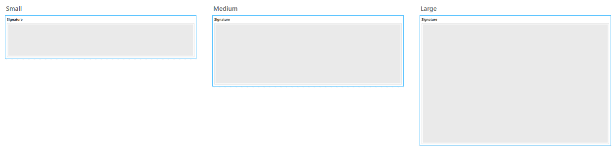
The size of the signing box: Small, Medium or Large.
Fields
Fields: Related List, Related Library
Select edit fields to choose the columns of the related list or library and set them up.
Select field instance
Fields: All, and widgets
A field can be on the form more than once, for example in two tabs. Definition is shared by all copies. Behavior, Label and Field theme can differ for each copy. Previous and Next select the copy you are changing. They are greyed out when the field is on the form only once. See Using the Same Field More Than Once.
Behavior
State
Fields: All
How this copy of the field behaves on the form:
| State | Meaning |
|---|---|
| Inherit from section | Follows the State of its section |
| Mandatory | Must be filled in |
| Optional | Can stay empty |
| Read-only | Shown, but can't be changed |
If Required is on, Optional isn't offered. A calculated field is always read-only, and so are built-in columns such as Created. Rules in the Logic tab can change the state while the form is used, with the step Field state.
Edit mode
Fields: Related List
How people edit the rows:
- Inline: in the table itself.
- Embedded dialog: in the related list's own Sintel Apps form, which opens over the main form.
See Related List.
Sort field
Fields: Related List, Related Library
The column the rows are sorted by. Sort order sets Ascending or Descending.
Layout
Fields: Related List, Related Library
Fit to width squeezes the columns into the width of the form. Single row with scroll keeps each row on one line, and people scroll sideways.
Alternate row coloring
Fields: Related List, Related Library
Every other row gets a light background, so long tables are easier to read.
Label
Fields: All, and widgets. This applies to all the settings below.
The eye icon next to Label hides the label of this copy of the field.
Text
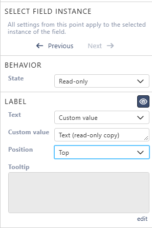
Taken from field's Title shows the Title. Custom value shows your own text, only on this form and only for this copy.
Position
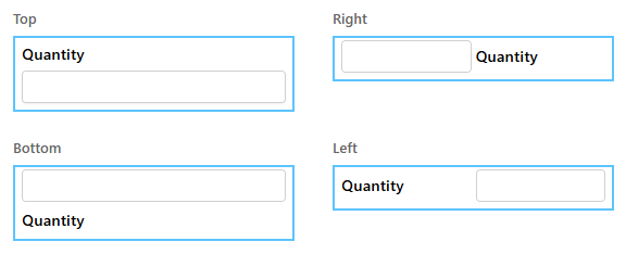
Where the label is: Top, Right, Bottom or Left of the field.
Width
How wide the label is when Position is Left or Right: Narrow, Normal or Wide.
Tooltip
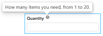
Help text behind an info icon next to the label. Select edit to write it. Use it to explain what to enter.
Field theme
Fields: All, and widgets
The look of this copy of the field: the Font, Size and colour of the Label, and the colour of the Body.
Each setting first follows the section the field is in, and through it the tab and the form. To use your own value, pick or type it. Select the crossed-out link icon to follow the section again. Reset to default makes all of them follow the section again. For the whole form, see Theme & Styling.
Related: Layout Tab (Overview).