

Appearance
Buttons
Designer › Layout › Widgets › Buttons
The Buttons widget puts buttons anywhere in the form, for example Save and Close at the end of a long form, or Approve next to the fields the approver checks.
Add the widget
- In the Layout tab, open Widgets on the left.
- Drag Buttons into a section. It starts with two buttons, Save and Close.
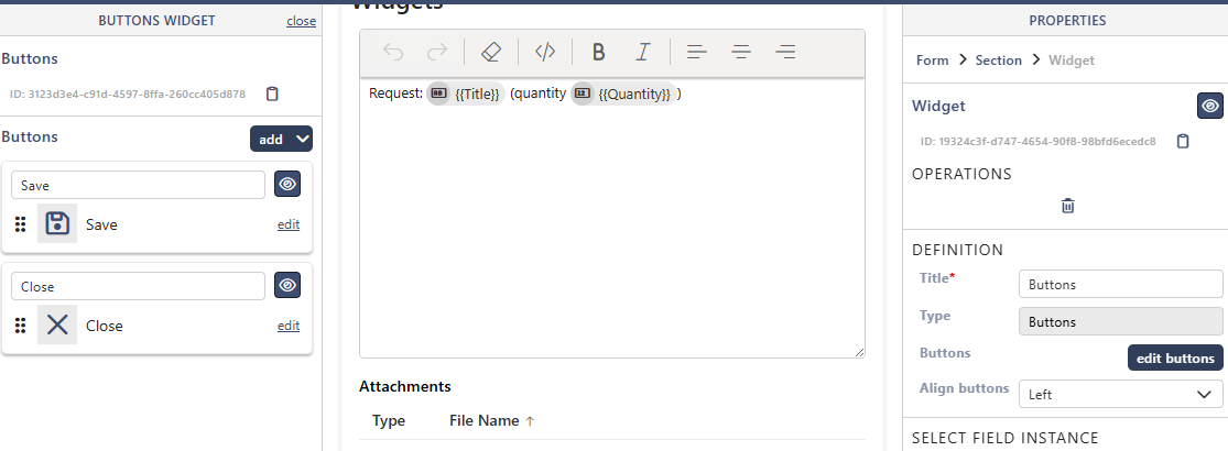
- Select the widget and select edit buttons to change them (below). Align buttons places them Left, Center or Right.
- Save the form.

Tip: to show the buttons on their own, without a box around them, put the widget in a section of its own and turn off the section's Elevated border. If the section has its own colours, set its Body colour under Section theme to the form's background colour (white unless you changed Form background). You can also hide the section's title with the eye icon next to it.
Edit the buttons
edit buttons opens the list of buttons on the left. add adds a button:
| Button | What it does |
|---|---|
| Save | Saves the item. With Close form after save (on to start with) it also closes the form. Not shown in view mode |
| Exit | Closes the form, like Close in the top bar. Shown as Close |
| Export to PDF | Exports the item to PDF. Shown only when PDF export is on in Settings |
| Action Button | Does a workflow action, for example Approve. It saves the item and closes the form |
| All Missing Actions | Adds an action button for each workflow action that doesn't have one yet |
| Custom Button | Runs your own JavaScript (below) |
Save, Exit and Export to PDF can each be in a widget once. Drag the handles to change the order, use the eye to hide a button, and edit to change it.
Button properties
- Label, Text size, Text color, Icon, Icon size, Icon position, Background, Width and Tooltip set how the button looks.
- For an Action Button: Action is the workflow action. With Inherit properties from action on, the button takes the action's name, icon and tooltip, and the colour of the status it leads to. Turn it off to give the button its own label, for example Approve for two different approve actions.
- For a Custom Button: Code holds the JavaScript. Select open editor to write it. The code can use the Sintel Apps JavaScript API, see Using the JavaScript API in Logic.
Good to know
- An action button follows its action. It's hidden or greyed out when the person can't do the action.
- The Close button isn't shown on forms for external users.
- The Logic step Custom button state shows, hides or disables custom buttons, for example to show a button only to one group.
Related: Workflow Actions, Layout Tab (Overview).