

Appearance
Sections and Tabs
Designer › Layout › Section
Every field on a form sits in a section. A section groups fields under a title, for example Request details or Delivery. A new form starts with one section.
A tabbed section holds several tabs, and each tab holds its own sections. Use it for long forms, so people see one part at a time.
Add a section or tabs
Select the orange + button at the bottom right of the form. Then choose what to add:
- Section: a block of fields with a title.
- Tabbed section: a block with tabs. It starts with three tabs.
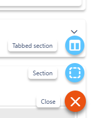
The new section goes below the selected one. With nothing selected, it goes at the end of the form. When a tab, or a section inside a tab, is selected, the + button adds a Tab or a Section within tab instead.
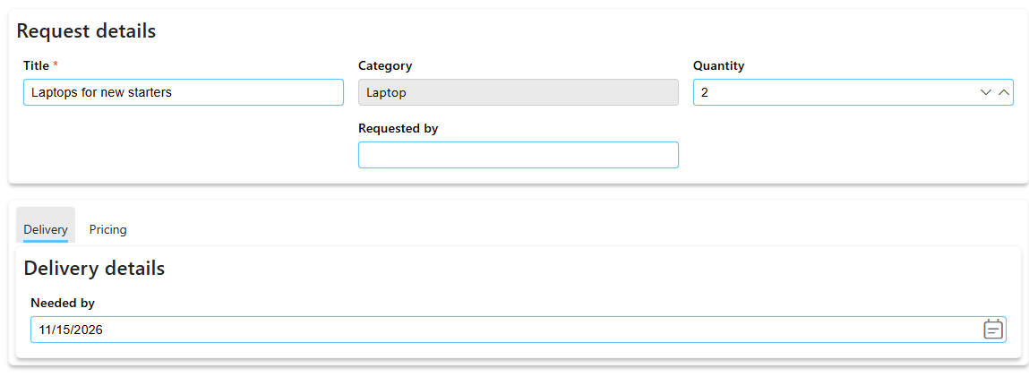
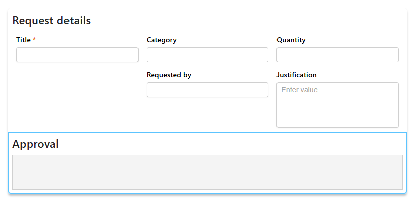
In the form, a section and a tabbed section look like this:
Section settings
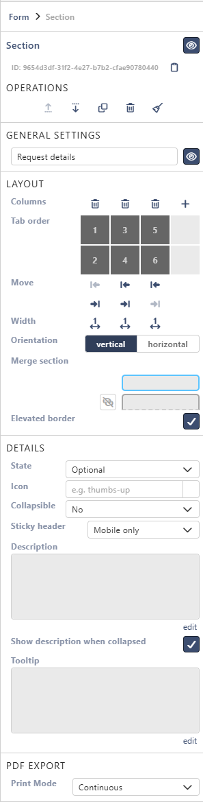
Select a section's title on the form. Its settings appear in the Properties panel on the right.
Operations
The icons under Operations, from the left:
- Move up and Move down move the section on the form.
- Clone copies the section. The copy appears right below the original, with - Copy after its title. You choose how to copy the fields:
- Link to existing fields places the same fields again, so both copies show the same values. See Using the Same Field More Than Once.
- Create new fields creates new list columns for the copy. Built-in columns such as Title stay linked.
- Delete removes the section and its fields from the form.
- Clear all removes all fields from the section, but keeps the section.
The list columns of removed fields stay in the list with their data. You find them on the Existing tab, under Unused.
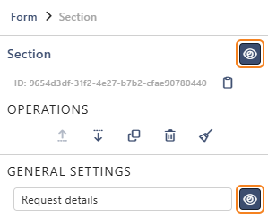
The eye icon next to Section hides the whole section on the form. A rule in the Logic tab can show it again (see Change sections with rules).
General Settings
The section's title. The eye icon next to it hides only the title, not the section.
Layout
| Setting | What it does |
|---|---|
| Columns | The bin icon above a column deletes it, with its fields. The + icon adds a column |
| Move | The arrows move a column left or right |
| Width | Select the number under a column to switch between 1, 2 and 3. A column with 2 is twice as wide as a column with 1 |
| Orientation | The order of the fields. See Orientation |
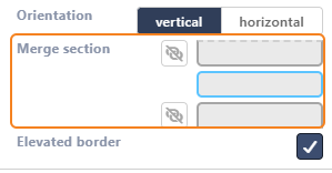
| Merge section | Joins the section with the one above or below into one box. See Merge section |
| Elevated border | A shadow around the section. On by default |
Orientation
Orientation decides in which order people move through the fields with the Tab key. On a phone, where columns are shown one under another, it also decides the order of the fields.
- vertical: down the first column, then down the next one. Columns are independent, so a tall field in one column doesn't push the others down.
- horizontal: row by row, from left to right. Fields in the same row line up across the columns.
The Tab order picture above the setting shows the order with numbers.
For example, the sample form Equipment Requests has Title, Category and Quantity in the first row. With vertical, the Tab key goes from Title to Needed by, the field under it. With horizontal, it goes from Title to Category.
Merge section
Merge section has two link icons. The upper one joins the section with the section above, the lower one with the section below. Merged sections look like one box, but each keeps its own title and settings. If merged sections have an elevated border, turning it on or off changes it for all of them.
Details
| Setting | What it does |
|---|---|
| State | Optional, Mandatory or Read-only. Fields whose own State is Inherit from section (the default) follow it |
| Icon | An icon before the title. Type a name to search, for example truck |
| Collapsible | No, Yes - collapsed by default or Yes - expanded by default. People open and close the section by selecting its title |
| Sticky header | Keeps the section's title at the top of the screen while people scroll through the section. Off, Always, Desktop only or Mobile only (the default) |
| Description | Text under the title. Select edit to format it |
| Show description when collapsed | Keeps the description visible when the section is closed. On by default |
| Tooltip | Help text behind an info icon next to the title. Select edit to write it |
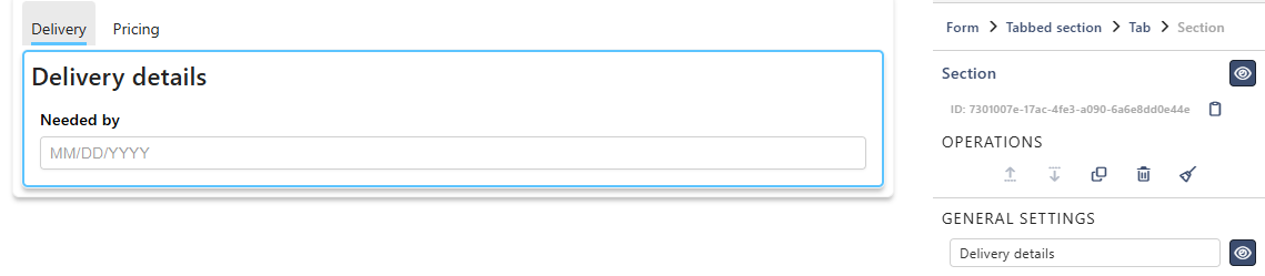
For example, the sample form has a section Internal notes set to Yes - collapsed by default, with a description. The form opens short, and people expand the section only when they need it. Above it is a tabbed section with the tabs Delivery and Pricing:
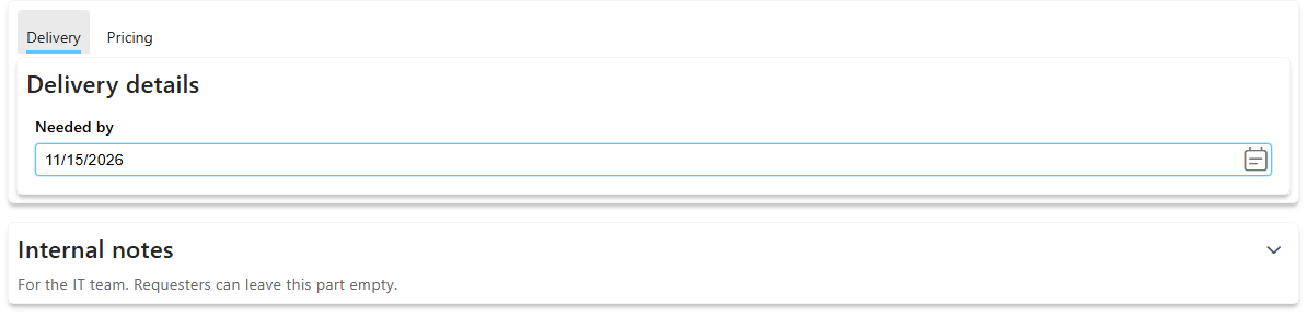
In the designer, selecting the title selects the section. To open or close it there, use the arrow next to the title.
PDF Export
Print Mode decides how the section appears in an exported PDF:
- Continuous: right after the previous section. The default.
- Start on new page: on a new page.
- Exclude from printing: left out of the PDF.
Tabbed sections and tabs
A new tabbed section looks like this on the form. Each of its tabs already holds a section, Tab Section. Drag fields into it.
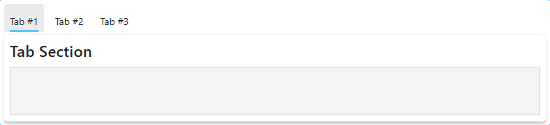
The tabbed section
To see its settings, select the empty space to the right of the tabs. When a tab is selected, you can also select Tabbed section in the path at the top of the properties panel (Form > Tabbed section > Tab). The settings are:
- Operations: move the tabbed section up or down, Delete it with all its tabs, or add a tab.
- Elevated border: a shadow around the whole tabbed section.
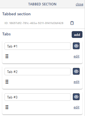
- Tabs → edit tabs: opens the list of tabs next to the properties.
- Sticky header: keeps the row of tabs at the top of the screen while people scroll. Off by default.
The eye icon next to Tabbed section hides the whole tabbed section.
In the list of tabs, you can rename a tab, hide it with the eye icon, and drag it by the dots to change the order. add adds a tab. edit selects the tab, so you can change its settings. close closes the list.
A tab
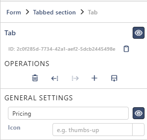
Select a tab's name on the form to see its settings:
- General Settings: the name of the tab and an Icon. The eye icon next to the name hides the name. With an icon, the tab then shows only the icon.
- Operations: Delete (with everything in the tab), move the tab left or right, add a tab, and add a section to this tab.
The eye icon next to Tab hides the whole tab.
Sections in a tab
A section inside a tab has the same settings as any other section. Select it to change its title, columns, state and so on. The path at the top of the properties shows where it is: Form > Tabbed section > Tab > Section.
Change sections with rules
Rules in the Logic tab can change sections and tabs while people fill in the form. For example, show a Finance tab only to the Finance group. The steps are Section Title, Section Description, Section Visibility, Section State, Section Collapse and Set Tab Visibility. See Understanding Steps.
The look
Fonts and colours are set at the bottom of the same panel, under Section theme and Field theme, and for tabs also Tabbed section theme and Tab theme. They change only the selected section, tab or tabbed section, and what's inside it. For the whole form, see Theme & Styling.
Tips
- Give sections short, clear titles. People scan the titles to find their way.
- Use a tabbed section when a form needs a lot of scrolling.
- Set State on the section, not on each field, when a whole part of the form is read-only.
Related: Layout Tab (Overview).