

Appearance
Version History, Spacer and Header/Footer Widgets
Designer › Layout › Widgets
Three small widgets that have no article of their own:
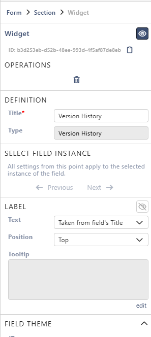
- Version History shows the earlier versions of the item.
- Spacer adds space, or a line of text, between items on the form.
- Header/Footer adds a title, a subtitle and images, for example a company logo.
Add them from Widgets on the left of the Layout tab. Drag the widget into a section. Select it on the form to see its settings in the Properties panel on the right.
The settings under Label and Field theme are the same for all fields and widgets. See Field Properties.
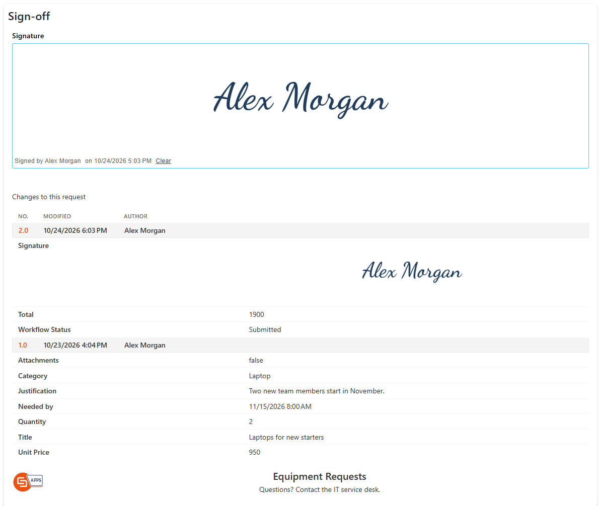
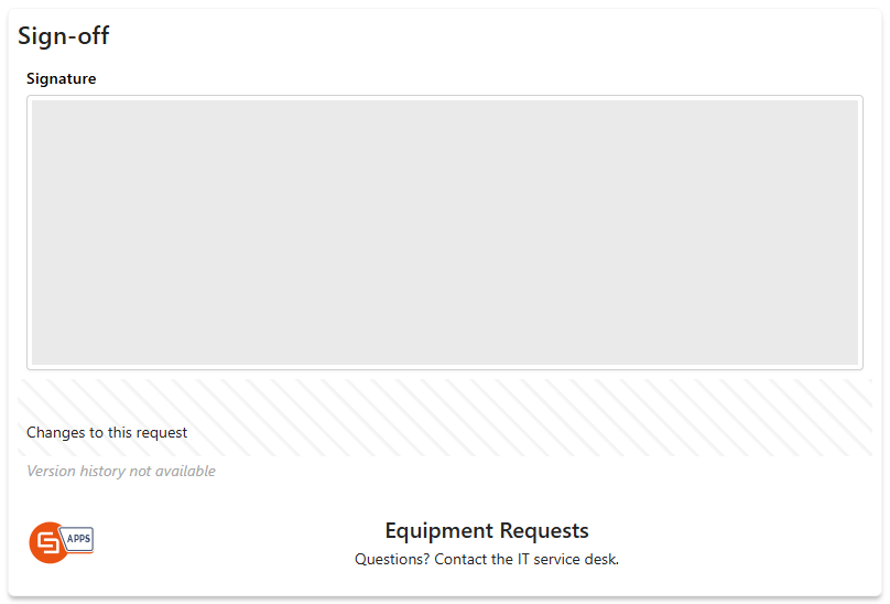
For example, the sample form Equipment Requests ends with a section Sign-off. It holds a Signature field, a Spacer with the text Changes to this request, a Version History widget and a Header/Footer used as a footer. In the form it looks like this:
Version History
The widget lists the saved versions of the item, newest first. For each version it shows:
- No.: the version number, for example 2.0.
- Modified: the date and time of the save.
- Author: who saved it.
- The fields that changed in that version, with their new values. Point to a value to see the value before the change. The first version lists all fields that were filled in.
In the example above, version 2.0 added the signature, set Total and changed the status.
The Version History icon in the form's top bar opens the same list in a panel, also when the form has no widget. See Using a Form.
The widget has no settings of its own. Its label is hidden at first. Select the eye icon next to Label to show the title above the list.
The widget shows Version history not available:
- when Version history is turned off in Settings › List settings (see Settings Tab (Overview));
- on a new item, before it's saved;
- on the external form, for people outside your organisation;
- in the designer.
Spacer
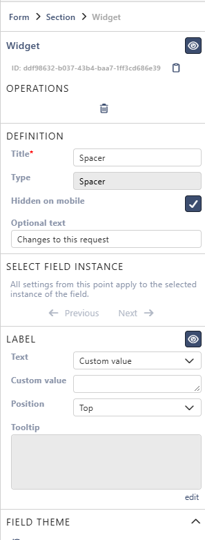
A Spacer adds empty space between fields. You can also put a short line of text in it, for example a heading for the next part of the section.
| Setting | What it does |
|---|---|
| Hidden on mobile | Leaves out the Spacer on a phone, where space matters more |
| Optional text | Text shown in the Spacer. Leave it empty for just space. To show a field value, type its token, for example {{Title}}. See Show field values |
Header/Footer
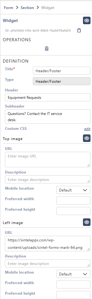
The Header/Footer widget shows a title and a subtitle, with up to four images around them. Place it at the top of the first section for a header, or at the end of the form for a footer.
A new Header/Footer shows Form name, a line of sample text and the Sintel Apps logo. Replace them with your own.
| Setting | What it does |
|---|---|
| Header | The title, in one line |
| Subheader | The text under the title |
| Custom CSS | Select edit to add CSS for this widget |
| Top image, Left image, Right image, Bottom image | Each image has the same settings. See Image settings. The eye icon next to its name hides the image |
In Header and Subheader, type {{ to add the value of a field, for example the request's Title. In the form, the value of the field is shown instead.
Image settings
The settings of each image:
| Setting | What it does |
|---|---|
| URL | The web address of the image, for example your logo on a SharePoint site |
| Description | A short text about the image. It shows when people point to the image, and screen readers read it |
| Mobile location | Where the image goes on a phone. On top puts it above everything, At bottom below everything. With Default, the top and left images go above the text, and the right and bottom images below it |
| Preferred width, Preferred height | The size of the image in pixels. If you set only one, the other follows the image's proportions |
Under Configuration, at the bottom of the panel, Copy configuration copies the header, subheader, images and Custom CSS. Paste configuration puts them into another Header/Footer, also on another form. It replaces that widget's own header, subheader, images and CSS.
For example, the footer of the sample form has the header Equipment Requests and the subheader Questions? Contact the IT service desk. It keeps the logo as the left image:
Tips
- To use the same Header/Footer on all forms of a site, set it up once. Then use Copy configuration and Paste configuration.
- Use an image address that everyone who fills in the form can open. If the form is shared with people outside your organisation, they must be able to open it too. Otherwise the image doesn't show.
Related: Layout Tab (Overview), Signature Field.