

Appearance
Theme & Styling
Designer › Layout › Form properties
The theme sets the look of the whole form: colours, fonts, the width of the form, and the buttons at the top. You set it once in the form's properties. Sections, tabs and fields follow it, unless you change one of them on its own.
Where to find it
In the Layout tab, select Form in the path at the top of the properties panel, or select the empty area outside the sections. The theme settings are in the lower part of the panel. Each group opens and closes with the arrow next to its name.
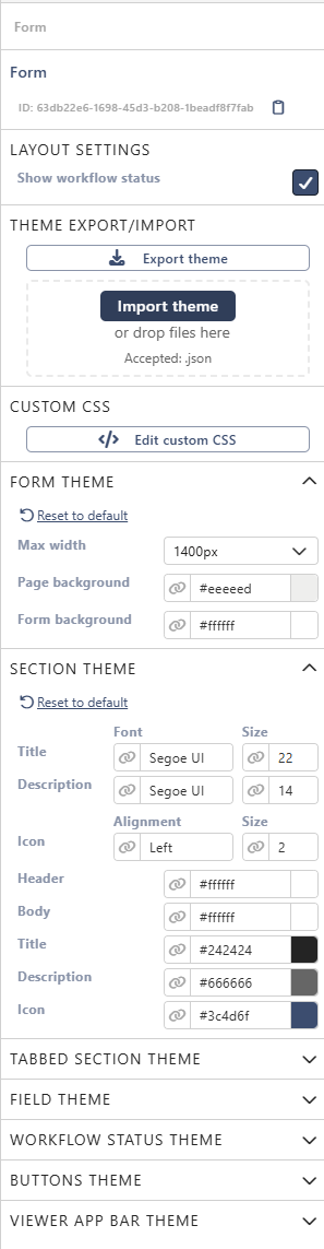
The designer shows your changes on the form right away. Save the form to keep them.
How a setting is inherited
Most settings have a link icon in front of the value:
- A grey link icon means the setting follows its parent.
- For the form, the parent is the default Sintel Apps theme.
- To use your own value, pick or type it. The icon changes to a crossed-out link on a dark background.
- Select that icon to follow the parent again.
Max width and the Workflow status theme have no link icon.
Reset to default, at the top of a group, puts every setting of that group back to the parent. For Max width and the Workflow status theme, it puts back the default values.
The same settings also exist at lower levels. A section, a tabbed section and a tab have their own theme groups in their properties. A field has its Field theme.
Each level follows the level it sits in, up to the form. A field follows its section, a section follows its tab, a tab follows its tabbed section, and the tabbed section follows the form. For example, a Section theme set on a tab changes all sections in that tab.
For example, the sample form Equipment Requests gets dark blue section headers with white titles. Under Section theme, Header is set to #3c4d6f, Title to #ffffff, and Description to a light grey. Every section changes at once:
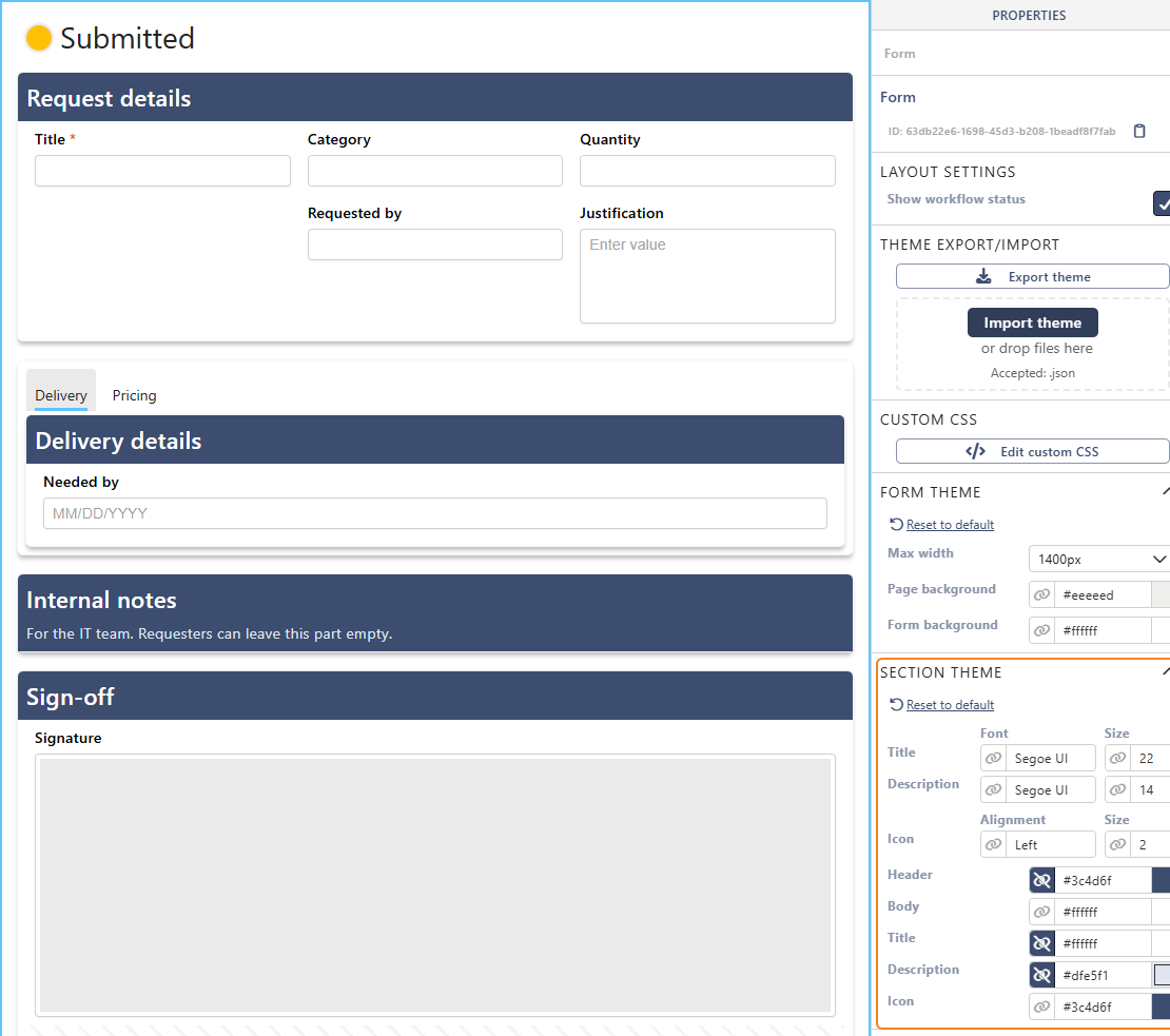
Tip: when you darken a background, also lighten the text on it. Otherwise titles and descriptions become hard to read.
The theme groups
Form theme
| Setting | What it does |
|---|---|
| Max width | The widest the form gets: from 600px to 1800px, or Full width. 1400px is the default |
| Page background | The colour around the form |
| Form background | The colour of the form itself |
Section theme
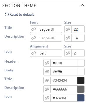
The look of every section:
- Font and Size of the section Title and Description.
- Alignment of the section Icon (Left or Right) and its Size.
- Colours of the Header, the Body, the Title, the Description and the Icon.
Tabbed section theme
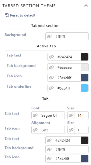
The look of every tabbed section and its tabs:
- Tabbed section: the Background of the whole tabbed section.
- Active tab: the colours of the selected tab, for Tab text, Tab background, Tab icon and Tab underline.
- Tab: the other tabs.
- Font and Size of the tab text.
- Alignment (Left or Top) and Size of the tab icon.
- The colours of the Tab text, Tab background and Tab icon.
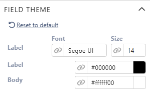
Field theme
The Font, Size and colour of every field's Label, and the colour of the field's Body.
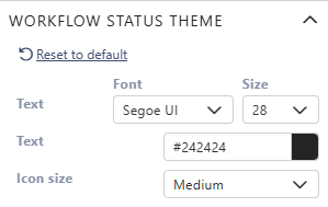
Workflow status theme
The look of the status shown at the top of the form: the Font, Size and colour of its Text, and the Icon size. It doesn't change the Workflow Status widget. To hide the status at the top, turn off Show workflow status under Layout settings.
Buttons theme
The Text and Background colours of the Save button and the Close button at the top of the form. In a Buttons widget, Save buttons use the Save colours and Exit buttons the Close colours, unless you set the button's own colours.
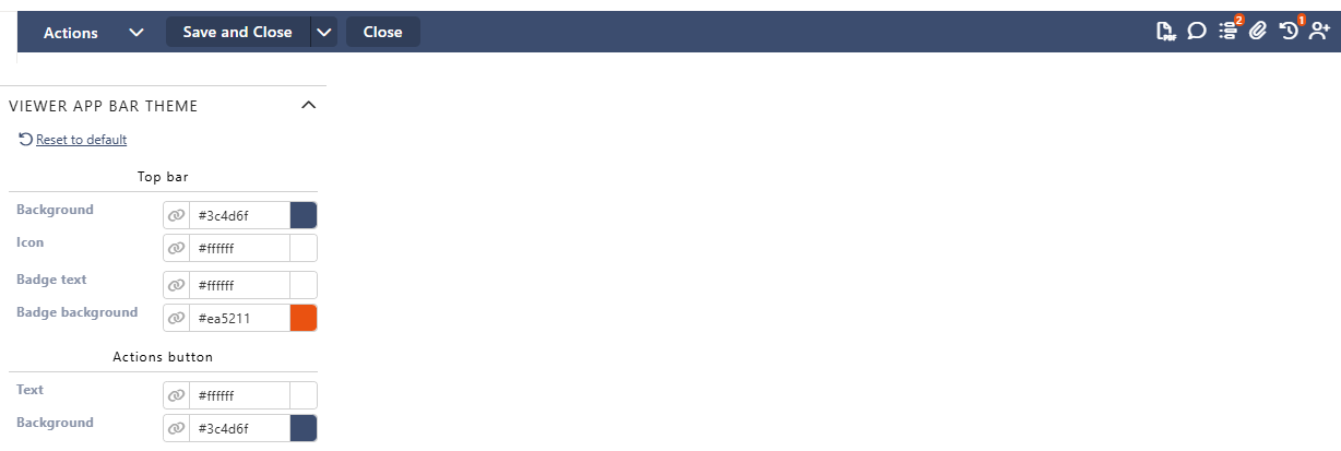
Viewer app bar theme
The bar at the top of the form:
- Top bar: its Background, the Icon colour, and the Badge text and Badge background. Badges are the small counters on the icons, for example the number of comments or attachments.
- Actions button: the Text and Background of the Actions menu button.
Use the same theme on another form
Theme Export/Import copies a theme between forms.
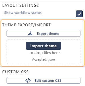
- On the form with the theme, select Export theme. Save the file. Its name is theme-export.json unless you change it.
- Open the other form in the designer and select Form.
- Select Import theme, or drop the file on the box below it.
- Overwrite Custom CSS is on. Leave it on to bring the Custom CSS of the first form too. Turn it off to keep this form's own CSS.
- Select Apply, then save the form.
Important: importing replaces the form-level theme settings of this form, and they can't be recovered. Export this form's theme first if you might want it back. Settings on single sections, tabs or fields stay as they are.
While the import waits for Apply, the Custom CSS and theme groups are hidden in the panel.
The file holds the form-level theme groups, the workflow status look and the Custom CSS. Changes made on single sections, tabs or fields aren't in it.
Custom CSS
For changes the theme groups don't cover, select Edit custom CSS. Write your CSS in the editor, then select Apply & Close and save the form.
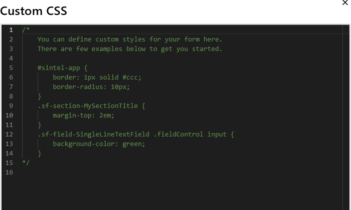
The editor starts with a few examples in a comment. The form's elements have class names that start with sf-, for example:
| Class | Element |
|---|---|
.sf-form | The whole form |
.sf-section | Every section |
.sf-section-header | The header of every section |
.sf-section-<Title> | One section, by its title in one word with capitals. Internal notes gives .sf-section-InternalNotes |
.sf-field-container-<InternalName> | One field, by its internal name written the same way. request_date gives .sf-field-container-RequestDate |
.sf-tabbedSection | Every tabbed section |
.sf-pdf-export | The form while it's exported to PDF. Use it for print-only styles |
For example, this puts more space above the section Internal notes:
css
.sf-section-InternalNotes {
    margin-top: 2em;
}
Where Custom CSS works:
- In the designer, the form shows your CSS while you type. Cancel undoes it. The designer applies it to the form area only, not to the top bar.
- In the form, for everyone who opens it.
- In the PDF export.
Use your browser's developer tools to find the class of an element.
Related: Layout Tab (Overview), Sections and Tabs, Field Properties.